The scale
As of January 17th, 2022, the entirety of Digipiedra weighs:
1.89 MB (1,890kB)
If each kB weighted a milligram, Digipiedra would be as heavy as:
a playing card
It includes:
3 games,8 illustrations,
6 illustrated dreams,
4 pictures,
3 illustrated blog entries,
3 miscellanea,
3 illustrated lessons,
43 links and
10 shelved items,
among others!
The average webpage is too bloated
As of 2021, the average webpage (not website! A single page of a website, which is a collection of webpages) weighs around 2.2MB, with a 15.1% increase in size in only the last year (2020), according to the http archive reports.
Some data weight comparisons:
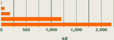
- RAM memory in an IBM 360 computer, used on earth in the Apollo 11 moon landing: 4kB.
- RAM memory in a Commodore 64 computer: 64kB.
- Alice's Adventures in Wonderland by Lewis Carroll, in plain text: 170kB.
- Moby Dick by Herman Melville, in plain text: 1.2 MB, 1200kB.
- The average webpage as of 2021: 2.2MB, 2200kB.
Here's how these look in a bar graph, in order:
Why should we care about website weight?
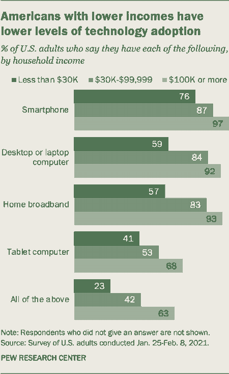
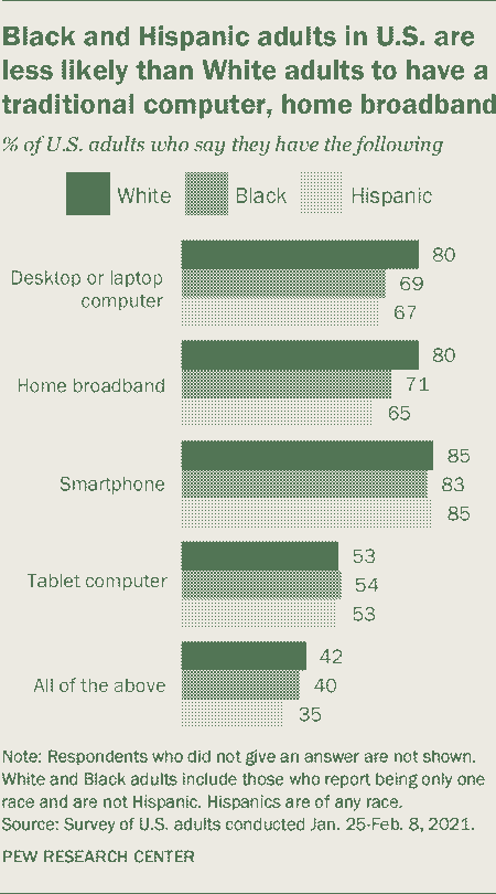
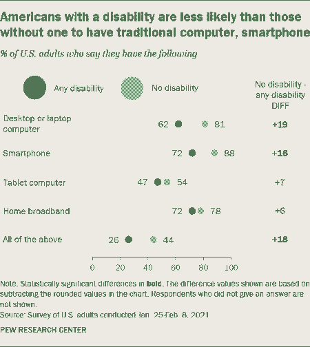
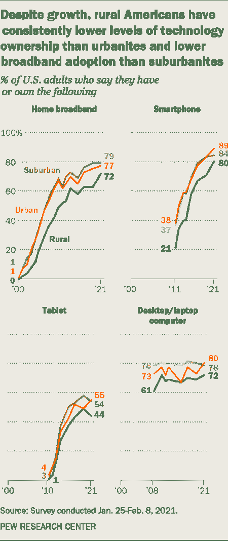
1. Accessibility2.2MB per webpage is much bigger than what it could be. Many people, specially those that are part of marginalized groups, those in rural areas and those from poorer countries, struggle daily to access information due to slow Internet speeds. This Internet divide is also increasing every year, and it's related to general technology access. See the following articles and paper:
- How Many Americans Lack High-Speed Internet?
- Digital divide articles by the Pew Research Center
- The bad news is that the digital access divide is here to stay: Domestically installed bandwidths among 172 countries for 1986–2014
These following figures apply to the U.S. population, from the Pew Research Center articles mentioned above:
 2. Environment
Websites don't live in an ethereal cloud. They are stored in computer servers which need to be on all the time, so that visitors can access the information whenever they choose to enter the website.
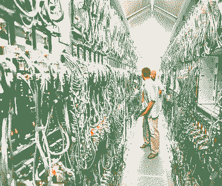
Image: A server rack corridor in Bing Maps' data center. All of those computer servers need electricity for power and refrigeration.
According to a study by a team from MIT, Purdue University, and Yale University, all Internet activity as a whole (without accounting for mobile data) has an global annual carbon footprint which is roughly equal to the annual carbon footprint of all activities in Sweden and Finland combined. Its annual water footprint (from the hydroelectricity used to power data processing, among other things) is approximately equivalent to filling one million Olympic swimming pools, and its annual land footprint (land occupied by data processing centers and power generation for Internet activities) is about the size of Mexico City, Rio de Janeiro and New York City combined.
Video streaming is specially to blame, but the heavier and more inefficient a website is, the more it's also contributing to climate change. Many other common practices, such as streaming a file that will be used multiple times instead of downloading it once or sending spam e-mails are all a part of this issue.
Why is this happening?
How can any typical article, such as this one about best practices for increasing website performance (which is ironically 3.1MB in size), weigh much more than entire books?
The bloat doesn't come from the actual information shared on the webpage, since text is very light-weight. However, most websites use plenty of unnecessary assets that impact weight and performance. For example, Javascript code for cosmetic animations and tracking scripts that don't respect our privacy, stock images that don't add much to the site's content, really huge images that are sent in their full size to later be resized down in the page, or many different custom fonts, which although not as worrying as Javascript or big images, can be quite large at several hundred kilobytes (see this article on the impact of custom fonts). We are paying for all of this data... Even those that can't afford it.
For more information on website bloat, I recommend reading or watching this talk: The Website Obesity Crisis.
How do we solve it?
You do not need to be some sort of efficiency genius programmer to make a lightweight and beautiful website. Actually, doing that is easier than making a bloated one. Take it from me, because I am not that good at markup languages or programming.
If, like me, you're a newbie and just starting out by manually writing your plain static html website, it is probably already quite lean. Here are some easy things you can do to improve your site:
- Use images only when they truly add value to your content or illustrate a point you're making (if it's a stock image of a businessman, it's probably not adding much to your article)...
- ... And compress and/or dither images when possible: they will weigh much less! I usually dither images with Dither me this or Dither it, and later compress them with Shortpixel. You might not want to dither art, but it is very useful for images illustrating articles or blog entries. For art, Shortpixel's "glossy" compression will probably look still identical to the original. Alternatively...
- ... Use new compressed image file formats, such as WebP or MozJPEG. These formats are more efficient and lightweight than older compression algorithms such as JPEG, and supported in almost all browsers. Dithering is not the right choice for all kinds of images. It works for me, but it can make certain images weigh more than the non-dithered originals (in short, it depends on the image's pixel size, palette and complexity: I'm under the impression that the more colors the dithering palette has and the simpler the original image is, the more unnecessary noise/complexity dithering will introduce— therefore increasing weight instead of reducing it). Likewise, according to some tests I've done, WebP can sometimes produce heavier images than dithering, but it may be better for your case. You can use the online WebP/MozJPEG converter tool Squoosh.
- Do not use Javascript except when absolutely necessary. There some things you can only do with Javascript, but many other things that people default to Javascript for can be achieved by CSS only. See this list of things you can do with just CSS.
- Do not bloat your website with third-party ads, scripts and analytics. If you must, choose lightweight, simple, website-theme-based ads that will respect your visitors' privacy and bandwidth by not tracking them.
- Do not use a static website generator if possible. In exchange for automation, most of them tend to produce bloated and unreadable code, or load entire libraries even when they're not used in the page. However, there are some that are very simple, such as Bashblog (thanks to nosycat for telling me about it!).
- Choose to use a generic font. By not specifying any particular font, or by choosing one of the three generic font-types in your CSS (
font-family: sans-serif;,font-family: serif;andfont-family: monospace;) your website doesn't make your visitor's browser download a font file. Their browser will instead use its default fonts. - Unrelated to your website weight, but now that OLED/AMOLED screens are much more common, choosing a dark theme for your website can actually save battery on your visitor's device (since it won't need to light the pixels up as much). If you'd like it to be a toggable option (still on it myself), you can do it with CSS only, no Javascript needed. See this project to know how!
Finally, here's an article that lists even more ideas on how to make your website more efficient.